Planet Fitness is a renowned gym known for its inclusive and judgment-free environment. Despite its welcoming nature, new members often feel nervous when starting their fitness journey. Many users prepare extensively by following YouTube tutorials and reading articles to make the most of their gym experience. Planet Fitness offers two membership levels, with the premium membership providing additional perks, including the ability to bring a guest for free. This benefit is especially appealing to those who prefer working out with a partner.
UX/UI Design
User Research
Interaction Design
Quality Assurance
Mobile Application
User Flow Improvements
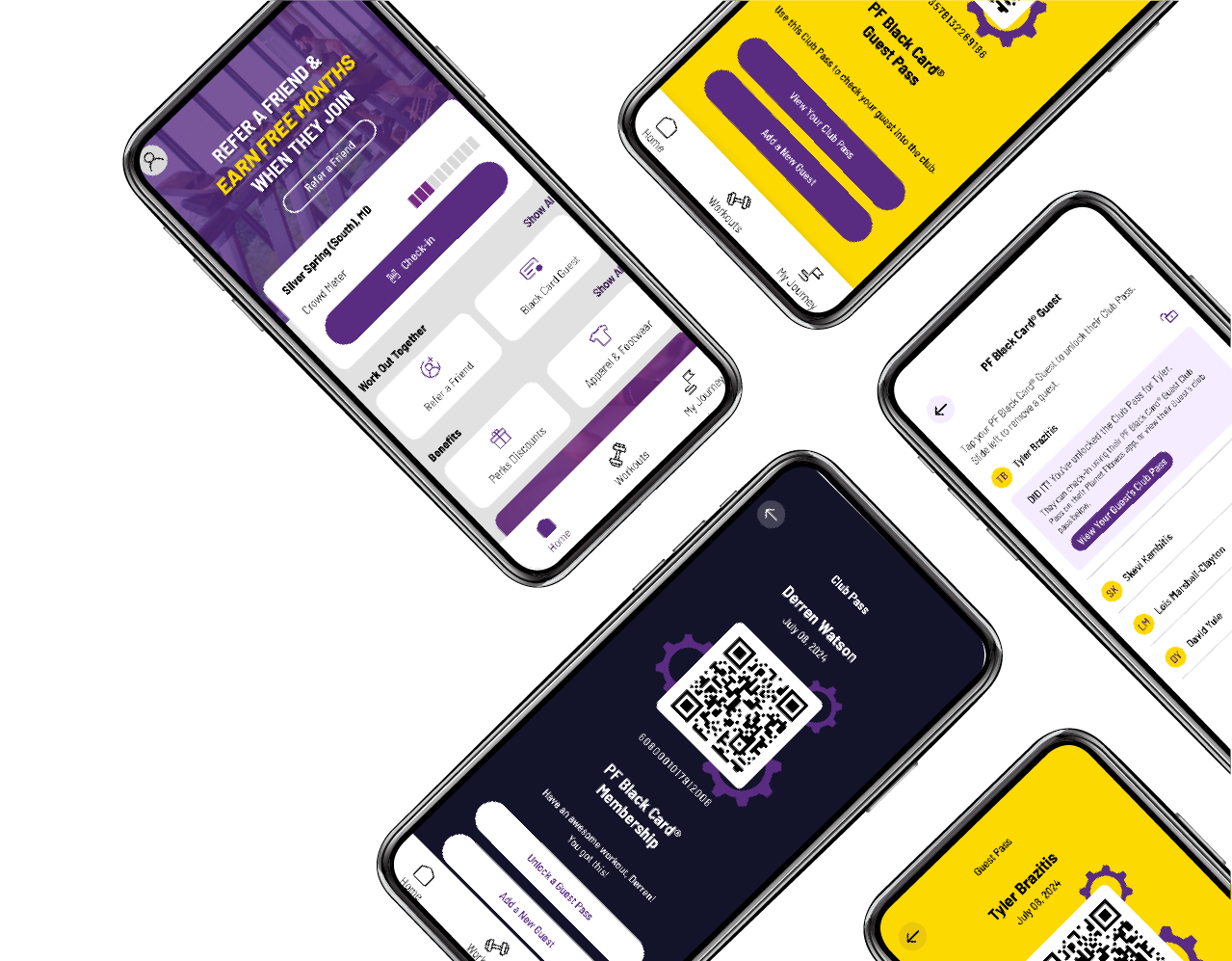
Updated App Design
High-Fidelity Mockups

Upon joining Planet Fitness, new members often face challenges when using the mobile app to check in, particularly when trying to check in a guest. The existing process involves multiple steps and can be frustrating, especially for users who are already anxious about their new environment. This project presented an opportunity to enhance the user experience by simplifying the check-in process, thereby reducing stress and making the gym experience more welcoming.
Currently, a user must take eight actions to open the application, check in, and then check in a partner:

The design of the Planet Fitness app is aesthetically pleasing and well thought out. However, a few small tweaks to the user flow can significantly improve the UX. The proposed solution reduces the number of steps required to check in a partner:

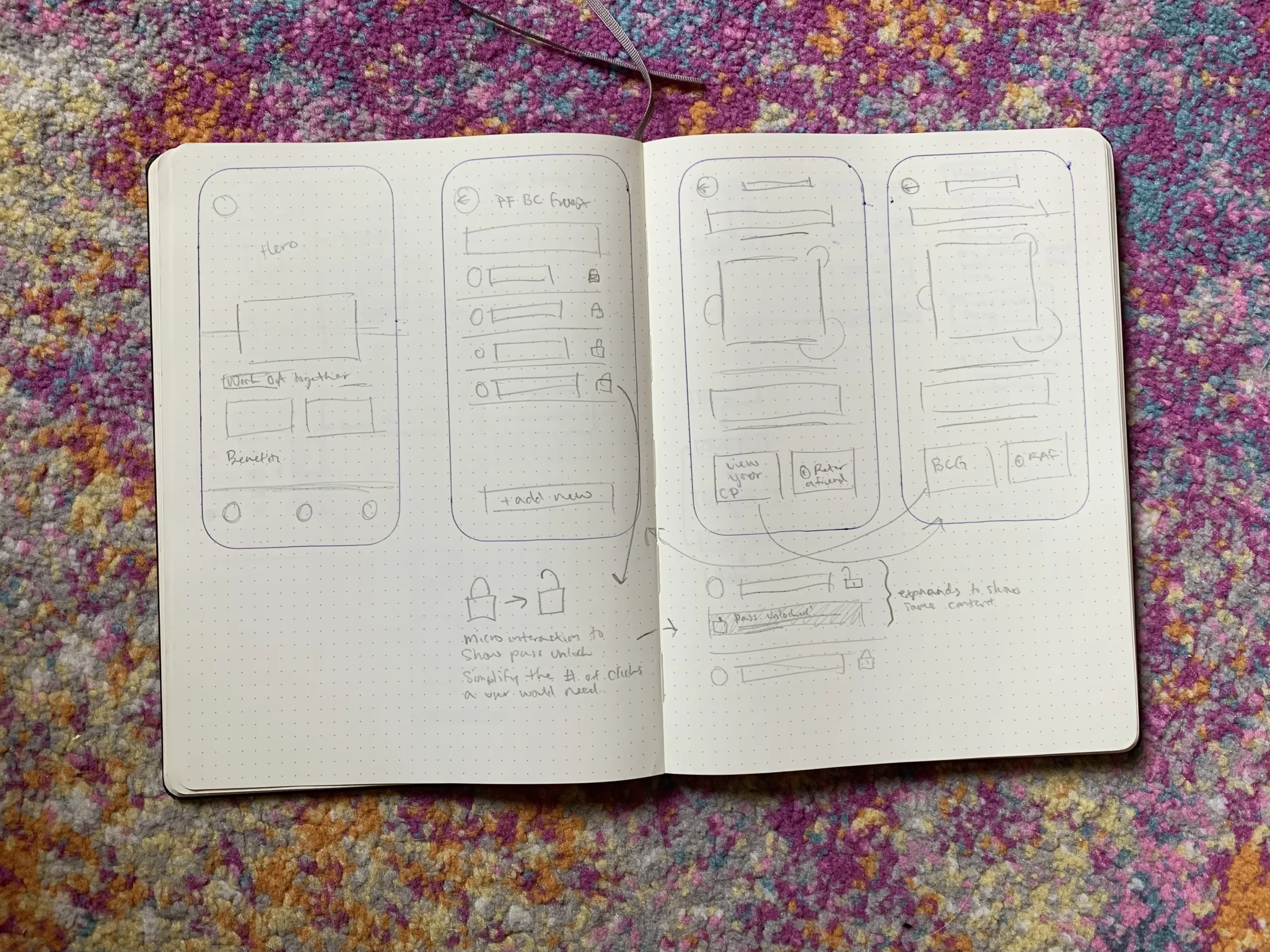
By understanding the user journey and completing a thorough investigation of how to simplify the user experience, I began crafting a first draft iteration of a possible interface solution. I leveraged existing design components to quickly create a cohesive experience that could easily be integrated into the existing application.

I developed an initial low-fidelity prototype in Figma to quickly create a functional application for testing. The goal was to ensure that users could easily understand and navigate the core functionalities of the app without the distractions of polished visuals.

I brought my low-fidelity prototype to my local Planet Fitness and tested it with a handful of gym-goers. The feedback from these real-world users was overwhelmingly positive. They appreciated the streamlined process and ease of use, which validated the design changes. Based on this feedback, I iterated on the design and created a high-fidelity prototype. This polished version incorporated the necessary adjustments and refinements, resulting in a more visually appealing and user-friendly interface.
The updated user flow, as demonstrated in the case study, has proven to be intuitive and efficient, significantly improving the hypothetical check-in experience for Planet Fitness members. This enhancement would save time for users and employees, alleviating unnecessary pressure and barriers to fitness that many users struggle to overcome. The result is a conceptual, more welcoming, and user-friendly app design that supports Planet Fitness’s mission of providing a judgment-free fitness environment.